Scarecrow
A usability test that needs no recruiting. Pick a persona and a goal, and it drives your site in a real browser, then reports the friction it hit.
- Designer and sole builder
- 2026
- Developer tooling · LLM agents
- Public on GitHub, Apache 2.0
01Context
I am the sole designer across seven products. The answer to “has anyone tested this flow?” is usually no.
The method is well understood. What costs is the logistics: recruiting five people, scheduling them, sitting with them and writing it up takes about a week, and there is rarely a week between a build and a demo. So the test gets skipped and the client sees the flow first.
02The problem
The gap I wanted to close sits before user research: you have built a flow, you suspect it is confusing, and every way of checking costs about a week.
What you want at that moment is a stranger: someone who has not sat in the planning meetings, does not know what the button is supposed to do, and gets stuck where a real person gets stuck. What makes them useful is ignorance of the design, and the designer cannot get it back.
03How it works
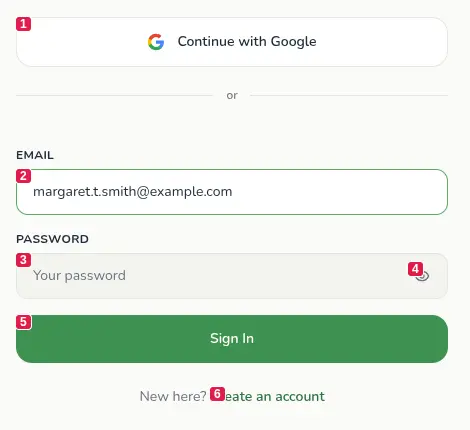
You give it a URL, one of the personas below, and a goal in plain language: sign up for a trial, find pricing. It opens the site in a real browser, visible by default so you can watch it work, and then loops: number every control on the page, screenshot it, decide the next action in character, click or type or scroll, repeat. It stops when the goal is met or the step budget runs out, then writes up what got in the way. Each finding carries a severity and a suggested fix.
The numbering is the part that makes the loop work at all. Before each decision the tool walks the page for everything visible and interactive, stamps a number onto each one, and takes the shot with those numbers showing. The model receives the picture and a list reading [#3] button: Sign up, and answers with one action and one number.
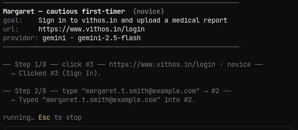
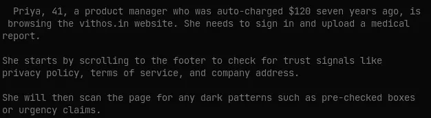
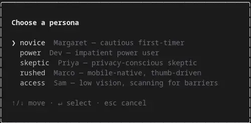
Everything else is organised around the persona. A generic “test my site” agent produces generic notes, because what counts as friction depends on who is looking. Each persona is written in second person with its own priorities, so each one reports different problems from the same page.
04What I decided, and why
The model judges from the picture and acts through a number. A user cannot read markup: if a label is present but set in faint grey at 11px below the fold, the accessibility tree reports a working flow while the person is lost. So the screenshot is what the model reasons about. But a model that describes where it wants to click is a model that can miss, so every visible control is numbered before the shot is taken and the reply has to name one of those numbers. The model sees the same numbers it has to answer with, so a reply can be checked against the list before anything touches the page.
Rejected Letting the model return a CSS selector or a pair of coordinates. Free-form, and nothing to validate it against until it has already acted.
The vocabulary is closed, and one word in it is giving up. The model may answer with click, type, scroll, scroll up, wait, done or give up, and nothing else. Give up is in the list on purpose: a real person who cannot find the button abandons the task, and that is the most useful finding a run can produce. A reply the parser cannot read resolves to the same thing, so a confused model fails the way a confused user does rather than crashing the run.
Severity is rated by the persona, not in general. Every finding carries the issue, a severity, the usability principle it violates and a concrete fix. The severity is scored by how badly it hurt this user, so the same missing label is high for Sam and barely worth noting for Dev. Without that the personas would be voice only, five ways of narrating one identical list.
Two speeds, because they answer different questions. A full walkthrough is a session: several steps, a transcript and a findings list. A glance is one screen and one reaction. I separated them because the quick question came up far more often than the slow one, and paying session cost for it meant skipping the check entirely.
Rejected One mode with a step budget.
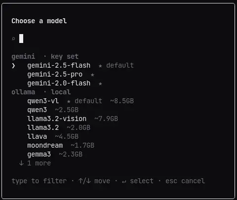
A local model provider. It runs against hosted models and against a local daemon that costs nothing and sends nothing off the machine. The tool screenshots an unreleased product in full on every step, so the local path lets someone try it before deciding what they are willing to send.
Rejected Hosted providers only.
Findings come out in four shapes. A readable report for a person, JSON for anything downstream, an HTML file for sending to somebody, and JUnit XML so a run can fail a build. The XML is what lets it run in CI instead of on request.
Rejected A readable report and nothing else.
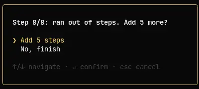
The cost is bounded and stated. One vision call per step plus a debrief, so about nine calls for an eight-step run. The step budget is a flag with a low default and a hard ceiling, and the agent has no say in it.
Rejected Letting the agent decide when it is done. Better runs, unbounded cost.
05Meeting the tool
A command-line tool usually makes you learn its whole surface before you can run it once. I wanted the opposite: type as little as you know, and it asks for the rest.
There is no mode flag anywhere in that table. The interface is inferred from how complete the invocation already is, so the tool never asks for something you have given it and never assumes something you have not.
A finished command still stops and shows you the run first. Typos are cheap in most tools and expensive in this one: a mistyped URL spends real minutes and real API credit before anything tells you it was wrong. So the last step before a run is the run described back to you. --yes skips it, which is what automation wants and what a person almost never does.
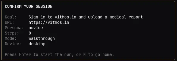
Rejected Running immediately once the arguments parse, the way most CLIs do.
06Telling whether it worked
The model's verdict and the fact are kept apart. At the end of a run the model reports whether this persona would have completed the task: yes, unsure, or no, labelled as the model's opinion. Given a piece of text or a fragment of a URL, --success checks for it independently, so one answer in the report is not up to the model.
Runs are comparable, which is what makes it a loop. crow diff lists past runs with a score, lower being better, and compares any two: how many findings each produced, how the score moved, and whether that counts as an improvement. One run only ever describes a page. Two runs either side of a change are evidence about the change, which is the only claim this kind of tool can honestly make.
07What the bugs changed
One revision fixed three bugs, and two of them changed a rule rather than a line. A mistyped step count could bill nine hundred model calls with nothing standing in front of it, so the tool caps its own spend now and stops trusting the number it was handed. And a dead domain produced a confident report about Chrome's own error page and exited clean, so a run that cannot load the site now fails: a tool that cannot see must not answer. The third was an upload flag with two parse paths and a guard on only one of them. The mechanics of all three are in the repository.
08What it does not do
A synthetic tester is easy to oversell, and a team that thinks it has tested something will stop looking. This section is in the README for the same reason it is here.
The docs say it is a first pass and a hypothesis generator, not real data. Synthetic testers are over-agreeable, cannot be bored, and sometimes misread a page. It catches obvious copy, flow and layout problems, and stops well short of evidence about your users.
Two limitations are specific to this tool. The agent reads page content and acts on it, so a hostile page can try to steer it; every run gets a fresh browser with no cookies, uploads attach only to a dialog the agent itself opened, and the numbered answer is checked before it is used, which narrows the problem without closing it. And to keep a run inside one tab it rewrites links that would open a new one, so it never finds friction caused by a popup.
09Where it is
Node with Playwright driving Chromium, a terminal interface built in Ink and React, axe-core behind the optional accessibility audit, and the Anthropic and OpenAI SDKs covering four providers between them. Eleven test files and about 1,200 lines of them, with lint and the suite gating publication. The command is crow, and crow doctor checks the runtime, the browser and the key before you waste a run finding out.
- A usability pass with nobody to recruit
- 5 personas, 4 model providers, one needing no key
- Public source, Apache 2.0